Minimalist packaging is something that’s taken the world by storm. While it does boil down to less is more, it’s more than that.
It’s simpler designs, with less busy work and more focus on the few things that are there. it’s simplicity and a big part of modern design.
You see this in all facets of life these days, especially in the world of packaging. Here, we’ll go over what minimalist packaging is, and why this design is one of the best ways for you to really stand out in the packaging world.
Elements of Minimalist Packaging
There are elements of minimalist packaging that really do stand out and are worth looking at for your packaging needs.
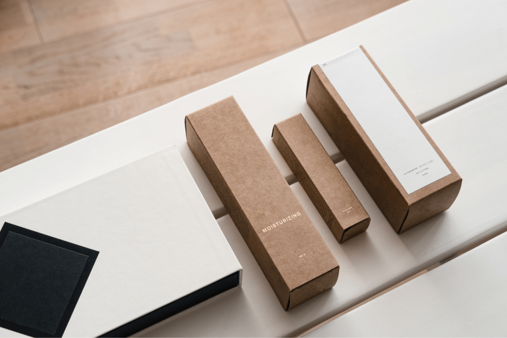
First, the design. You want the design to be clean and simple, without too much going on.
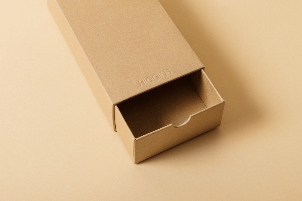
The use of negative space is the other one. Lots of times, the space is used completely, but negative or blank space does add to the charm of minimalism packaging. It builds better awareness of the packaging you wish to provide, and really aids with highlighting the logo and other aspects of your packaging.
Finally, the typography and color palettes are limited, as the focus is usually on keeping things simple. Less all over the place designs, and instead, focus on keeping on a solidified image that’s there.
Why Minimalism
There are a few reasons for minimalism. While some might find it a little blasé and boring, there are some benefits worth mentioning.
The first is less waste. You’re optimizing your costs, and not contributing to the ever-growing waste that packaging offers.
There is also a higher focus on your product. Without as much going on in the background, you’re able to show a lot of the product itself off, and it looks better in everyone’s eyes.
Finally, it is much better for the user experience. They don’t have to unwrap a billion different parts of the packaging, but instead open the box, maybe unfold some tissue paper, and then there are you. it’s less complicated, and it looks a lot better for a lot of companies.
Overall, it works wonders especially for health and natural brands. A lot are taking on the minimalist approach, and since then, they’ve been able to wow the masses.
How to design your minimalism packaging
There are a few design tips for minimalism packaging.
First, choose a logo and font that you have as the focus. From there, choose limited colors. For instance, a brand color might be good, with the typography either in the other color, or maybe black and white.
Second, don’t be afraid to utilize the negative space that’s there. placing the logo or the name of the business in the center might seem boring, but it’s a great way to highlight minimalism, because people will know immediately that it is from you, and not from anyone else.
Finally, make sure that you focus on the functionality and branding. You want to make sure that you’re able to show the different branding that’s there, and make it look better for the customer. You want to also ensure that the product is easy for you to open and utilize, without much trouble.
Overall, minimalism is an easy thing for you to use, with a lot of fun ways for you to provide customers with the best types of products that they can. use it today, and start on your journey to minimalism, so that those who are able to use your packaging are able to get the full benefits of the minimalism lifestyle.
